
Climate change has worsened the situation on the planet as greenhouse gas emissions continue to raise global temperatures and wreak havoc across the world. A new visualisation from Nasa now shows where most of the Carbon Dioxide is being released.
The visualisation is stunning since CO2, one of the biggest contributors to global warming and climate change is invisible to the naked eye.
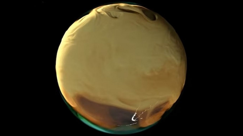
Using advanced computer modeling techniques, Nasa’s Global Modeling and Assimilation Office has created a visualisation that unravels the influences of sources and sinks of carbon dioxide and reveals where it is coming from and where it goes.
The visualisation shows the amount of CO2 being added into the atmosphere in 2021. The emissions have been released from fossil fuels, burning biomass, land ecosystems, and the ocean. Each source has been given a unique colour. While fossil fuels have been shown in orange, burning biomass is in red, land ecosystems in green, and the ocean is displayed in blue.
The view shows parts of Europe, the Middle East, and Africa, Australia, North and South America being engulfed in the carbon emissions released by multiple sources.
“Scientists are carefully monitoring how CO2 emissions from fires are altered by climate change, which is bringing longer and more severe fire seasons to many areas,” the Scientific Visualisation Office of Nasa, said.
The primary source of CO2 emissions is the burning of fossil fuels such as coal, oil, and natural gas. These activities occur in various sectors, including energy production, transportation, industry, and residential use.
The Intergovernmental Panel on Climate Change (IPCC), a scientific body established by the UN, has extensively assessed the scientific evidence and concluded that human activities, particularly the burning of fossil fuels, are the primary cause of the observed increase in greenhouse gas concentrations in the atmosphere.
Recent Posts
Ammonia
EXMAR’s Ammonia-Fuelled Gas Carrier Completes First Commercial Voyage
Technology
Momentum Builds for Nuclear-Powered Shipping as Regulation and Technology Advance
Dual-Fuel
Project CAPTURED Achieves EU ETS Recognition and IMO Backing for Onboard Carbon Capture